Scandinavian style is one of the most recognizable forces in contemporary visual culture, yet it is still often described as if it were a simple recipe that can be copied anywhere in the world. Light wood, white walls, clean lines, a few textiles, some potted plants - and supposedly you are done. In reality nothing could be further from the truth. This way of arranging space did not arrive as a manifesto or a neat program. It grew slowly out of everyday life and the experience of people who wanted their homes to be easier to live in and kinder to spend time in. Today it has become one of the clearest calling cards of Northern Europe. It is an export product, a visual language that people from Tokyo to New York can read instantly, even if they have never set foot in Oslo, Stockholm, Copenhagen or Helsinki. We see it in homes, offices, hotels, cars and interior catalogues, often without realizing how deeply it is rooted in the history, climate and social changes of the region. Why did this particular way of thinking about space and objects travel so easily, and what does it really say about the people who create in Scandinavia and those who choose to live surrounded by their work?
What we now call Scandinavian design did not begin life as a neatly defined movement. No one declared its birth. No committee sat down to write a list of rules. It emerged gradually as a response to what it meant to live in the north of Europe - to the climate, the light, the geography, the social structure and very ordinary daily needs. Long winters, short days and a severe landscape meant that the home became something far more important than a backdrop for entertaining guests. It had to be a refuge, a place of work, rest and togetherness. The objects that filled it had to be durable, functional and sensible. Purely visual fireworks were a luxury that was hard to justify. From this daily necessity, not from a fashion for minimalism, came the qualities we now instinctively associate with the north - simplicity, order, ergonomics, a feeling of calm control over one's surroundings.
This way of thinking developed alongside deep social change which, in the Nordic countries, took a particularly consistent form. Ideas of egalitarianism, accessibility and social responsibility were translated directly into architecture, planning and product culture. Designing was not treated as a privilege for the few but as something that sits naturally next to education or healthcare. A well shaped object or space was meant to be for everyone, not only for those at the top of the income scale. That perspective is one reason Nordic aesthetics have proved so resistant to fashion. Long before their principles appeared in lamps, chairs and home accessories, they were tested in the most demanding arena of all - architecture.

A laboratory of ideas - where Scandinavian design came from
If today the north is associated with gentle modernity, calm and a sense of order, it is largely because the first testing ground for this sensibility was architecture rather than interiors. In the Nordic countries modernism could not be pursued as a purely ideological experiment, detached from how people lived. Every mistake was felt immediately in the form of poorly lit flats, hostile squares or buildings that amplified discomfort instead of easing it. For years the north stood slightly aside from the grand arguments unfolding in Berlin or Paris. That distance allowed it to watch modernity with a cool eye and to take from it only what genuinely made sense.
Out of that reflection grew a current known as Swedish Grace - an elegant, stripped back version of classicism in which proportion and rhythm took the place of ornate decoration. Stockholm City Hall by Ragnar Östberg and the Stockholm Public Library by Gunnar Asplund both show how a public building can combine symbolic weight with a human scale and tranquil interiors washed with soft, diffuse light. In both cases what matters most is the experience of the person using the building, not the grand gesture of the architect. An even more theatrical example of Swedish Grace is Tändstickspalatset, the Matchstick Palace built for Ivar Kreuger. Here the work of leading artists of the time was subordinated to the idea of disciplined, understated luxury. All these projects share an obsession with the quality of space rather than with the external silhouette of the building. That concern will later become one of the foundations of the Scandinavian approach.
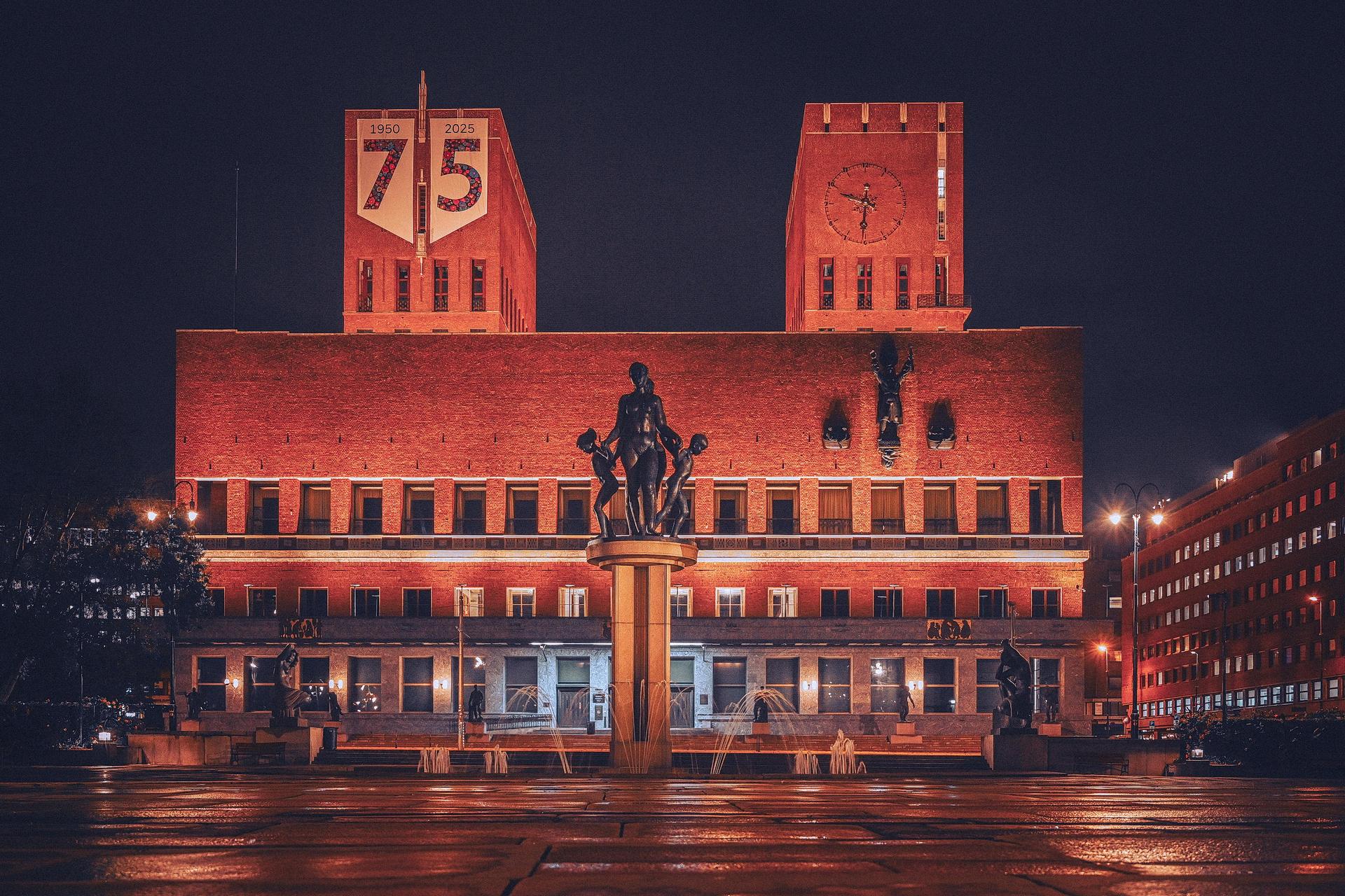
The Oslo City Hall is one of those buildings you are unlikely to confuse with anything else. Two massive red-brick towers, a little over 60 meters tall, rise up by the waterfront like blocky sentries guarding the city's entrance from the fjord. The simple, functionalist massing and warm, brownish brick have earned it a teasing nickname among locals - two blocks of brunost, Norway's famous brown cheese. Seen up close, though, this seemingly austere building is densely wrapped in detail - sculptures, reliefs and an astronomical clock that together tell stories of Norway's labor, mythology and everyday urban life. Inside, a monumental main hall serves as the setting for the Nobel Peace Prize ceremony, which only reinforces the building's symbolic status as one of the most important public landmarks in Scandinavia.
Home and everyday life as a manifesto - Carl and Karin Larsson
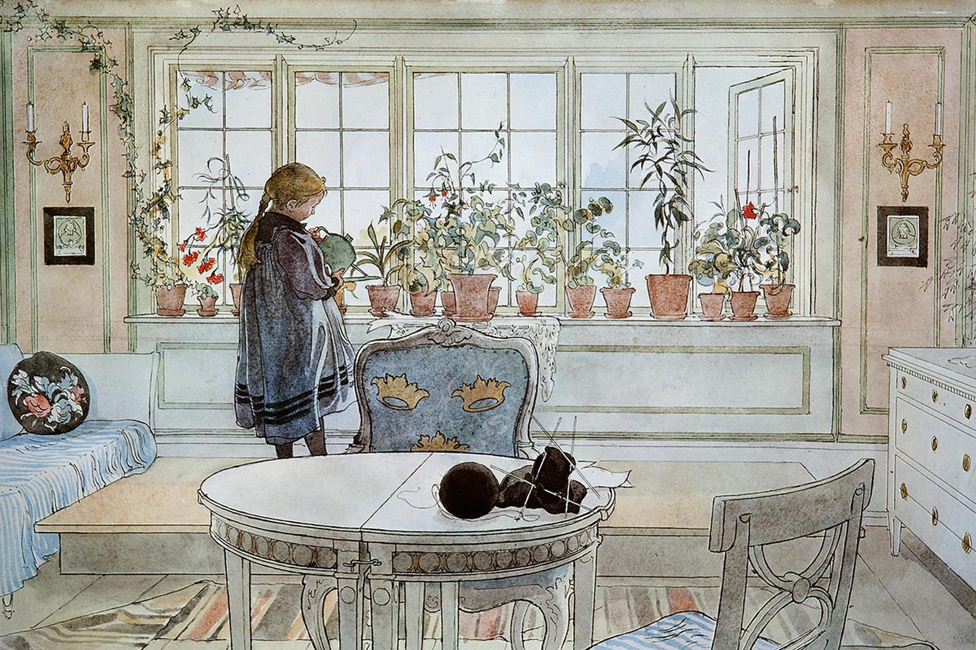
Long before anyone coined terms for modern movements, the Nordic way of living was being forged in a much more everyday setting - in the home. When Carl and Karin Larsson were furnishing Lilla Hyttnäs in Sundborn at the end of the nineteenth century, they deliberately rejected the prevailing model of bourgeois interiors, crammed with heavy furniture, busy textiles and strict separations between formal and service areas. In its place they proposed a house that was bright, open and organized around the comfort of daily family life. Furniture was light and easy to move. Textiles were simple. The color palette was tuned to natural light. The house was there to serve everyone who lived in it, including the children, not just visitors.
Carl Larsson recorded this vision in a series of watercolors that rapidly gained popularity in Sweden and Germany. From those images there emerged a kind of template for what we now think of as a Scandinavian interior - wooden floors, uncovered windows, freedom of movement, no sharp line between weekday and holiday. Karin Larsson played a decisive role. She designed the layout and textiles that quietly shattered the conventions of her time. Radically for that era, she also dispensed with the traditional division between front-of-house and back-of-house. Kitchen, dining room and living spaces flowed together into a single shared arena of life. The interior stopped acting as a stage set for social status and started to function as a tool for everyday living. This seemingly local story had a profound impact on later thinking about homes and interiors across Sweden.
Humanist modernism in practice - Alvar Aalto
If the Larssons gave Scandinavian style its human face, Alvar Aalto turned it into a complete language of architecture and industrial craft. The Finnish architect came of age at a time when modernism often took the form of a hard doctrine built on abstract rules. Aalto accepted modern technology, industry and functionalist thinking, but refused impersonality and rigid formalism. He was first and foremost interested in what spaces feel like for the people who use them.
The Paimio Sanatorium, completed in 1933, is the clearest expression of this attitude. The building was conceived as an instrument for healing rather than as an object in the landscape. Orientation towards the sun, ventilation, acoustics, the colour of the walls and even the shape of the furniture were all treated as parts of the same problem. The famous Paimio chair was designed to make breathing easier for patients lying halfway between sitting and lying. Its light bent plywood structure follows directly from medical and ergonomic requirements.
In parallel Aalto was developing techniques for bending wood and plywood that led, among other things, to the Stool 60 - a simple, stackable stool created from the outset for serial production. Aalto refused to draw a line between building, interior and furniture. He created complete environments built from natural materials, clear structures and a basic respect for the user. In his work you can see most clearly the idea that shaping space and objects in the north is understood not as a fashion statement, but as a responsibility for others.

Commodities meant to serve everyone
The next logical step was a move from buildings to everyday items. In the 1940s and 1950s designers in Scandinavia created furniture that we now encounter in museums, but that originally was meant simply to function in homes, offices and public buildings. Hans Wegner, a Danish cabinetmaker, spent his career refining the idea of a chair. The Wishbone Chair of 1949, with its Y-shaped back and woven cord seat, combines lightness, strength and an honest expression of construction. From the beginning it was intended for mass production, not as a one off piece for a handful of clients.
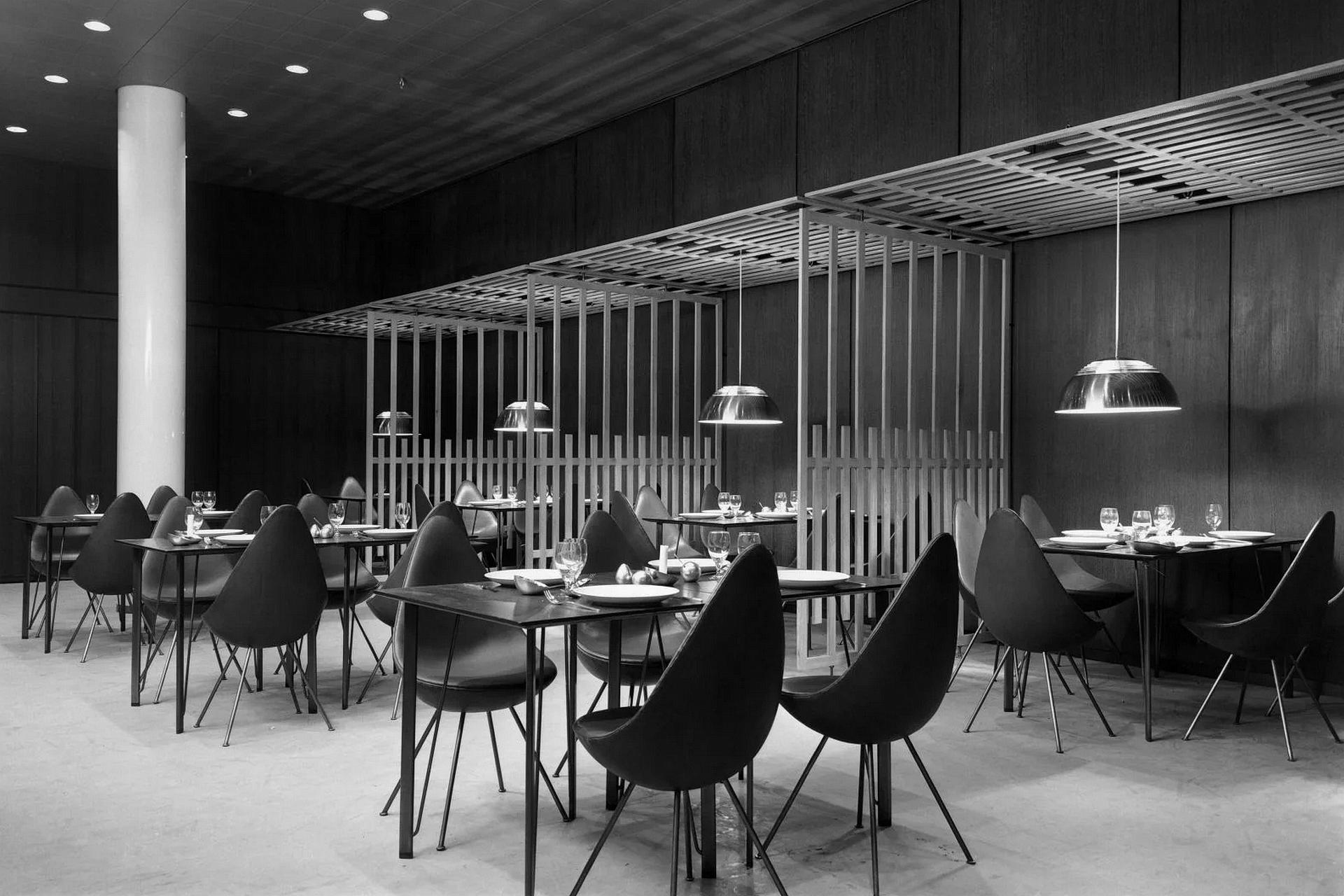
Arne Jacobsen pursued similar ideas, though in a more distilled modernist form. The Ant and Series 7 chairs, both made from molded plywood, became models for furniture that is simple, comfortable and tolerant of hard use. Designed in some cases with specific buildings in mind, like the SAS Royal Hotel in Copenhagen, they helped create coherent environments together with the architecture around them.
In Sweden, Bruno Mathsson turned almost obsessively to the physiology of sitting. His light loungers and chairs made from bent wood and webbing in canvas or leather gave way slightly under the user's weight and adapted to the human body. What these projects all have in common is a basic honesty towards material and person. Wood does not pretend to be metal. Structure is not hidden behind decoration. The goal is comfort in everyday use, not a striking photograph in a magazine.
When a local philosophy becomes a global language
Up to the middle of the twentieth century Scandinavian work in this field developed largely within the region, in a dialogue between architecture, craft and daily life. The turning point came in the 1950s, when a post-war Europe and America began to search for a new kind of modernity - more humane and less loaded with ideology. Objects and interiors from Denmark, Sweden and Finland turned out to be a near perfect answer. They were modern without aggression, functional without coldness, rational yet still warm.
The travelling exhibition "Design in Scandinavia", shown in the United States and Canada between 1954 and 1957, played a major role. The furniture, glass, ceramics and textiles on display formed a coherent story about ordinary life rather than a parade of eye catching one offs. American audiences recognized in the Scandinavian way of living a model for the "good life" - orderly but not stiff. At the same time institutions such as MoMA in New York were promoting the idea of good everyday objects and consistently highlighted work from the Nordic countries. Arne Jacobsen's Ant chair and many other pieces appeared in exhibitions as things that people might actually use, while also acting as textbook examples of good practice.
Established in 1951 and sometimes described as a kind of Nobel Prize for Scandinavian design, the Lunning Prize also helped build the region's reputation. Winners included Hans Wegner, Arne Jacobsen and Tapio Wirkkala. The message was clear. The north had developed its own mature language for shaping objects and spaces, one that could travel without sacrificing local values. Just as important, global success did not turn Scandinavian style into a distant luxury label.
Nordic projects in the age of mass production
The Scandinavian way of creating everyday objects was forced to confront the realities of serial production very early on. The Danish company Fritz Hansen, founded in the late nineteenth century, became one of the key producers of modern furniture in the 1950s thanks to its close collaboration with Arne Jacobsen. The Ant chair, designed in 1952, was originally created for the cafeteria of the Novo Nordisk factory. It had to be light, easy to clean, stackable and tough enough for constant use. Only later did it turn into an icon and a symbol of a new approach to furniture in offices and homes. The story of Series 7 followed a similar pattern. It became one of the company's most successful products. Its popularity was not based on an outrageous form but on the combination of ergonomics, a clean outline and a plywood molding process that allowed large scale production without destroying quality.
The north had developed its own mature language for shaping objects and spaces, one that could travel without sacrificing local values. Just as important, global success did not turn Scandinavian style into a distant luxury label.
In Sweden, the Nordiska Kompaniet department store and glass manufacturers such as Orrefors played a comparable role. Designers like Tapio Wirkkala and Stig Lindberg moved with ease between limited pieces and mass production. Wirkkala designed hand blown art glass as well as plastic bottles for Finnair airlines. Lindberg created patterns that ended up in the homes of the middle classes. They didn't draw a hard line between art and industry. What mattered was that an object be logical in form, intuitive to use and durable, whether it was destined for a gallery or a supermarket. One of the clearest examples of Scandinavian design is the Tripp Trapp children's chair. Designed in 1972 by Norwegian designer Peter Opsvik for Stokke, it began with a very simple observation - Peter's young son did not have a comfortable place at the family table. Instead of creating yet another piece of "children's furniture", Opsvik came up with a chair that grows with its user, thanks to adjustable platforms for the seat and footrest. This lets the child sit at the table at eye level with adults while keeping their feet properly supported. Made from solid beech wood and defined by a pared-back, almost sketch-like silhouette, Tripp Trapp has become one of Stokke's best-selling products and a permanent fixture in design collections at institutions such as MoMA in New York and the Victoria and Albert Museum in London.
The same philosophy produced objects that today can seem almost anonymous and yet have become classics. Fiskars scissors with orange handles, introduced in the 1960s, were based on ergonomic research. The now iconic color was first chosen simply because that pigment happened to be available in the factory. The design proved so successful that a pair of scissors eventually entered the MoMA collection as an example of good everyday engineering. The cheese slicer invented by Thor Bjørklund was a response to an unromantic problem - how to cut hard cheese thinly and neatly. A metal spatula with a sharp edge at the end has since become standard equipment in Norwegian kitchens and a staple of breakfast culture. None of these products were conceived as artworks, yet they ended up in design museums because they solve ordinary problems in an exemplary way.
Four pillars of Scandinavian style
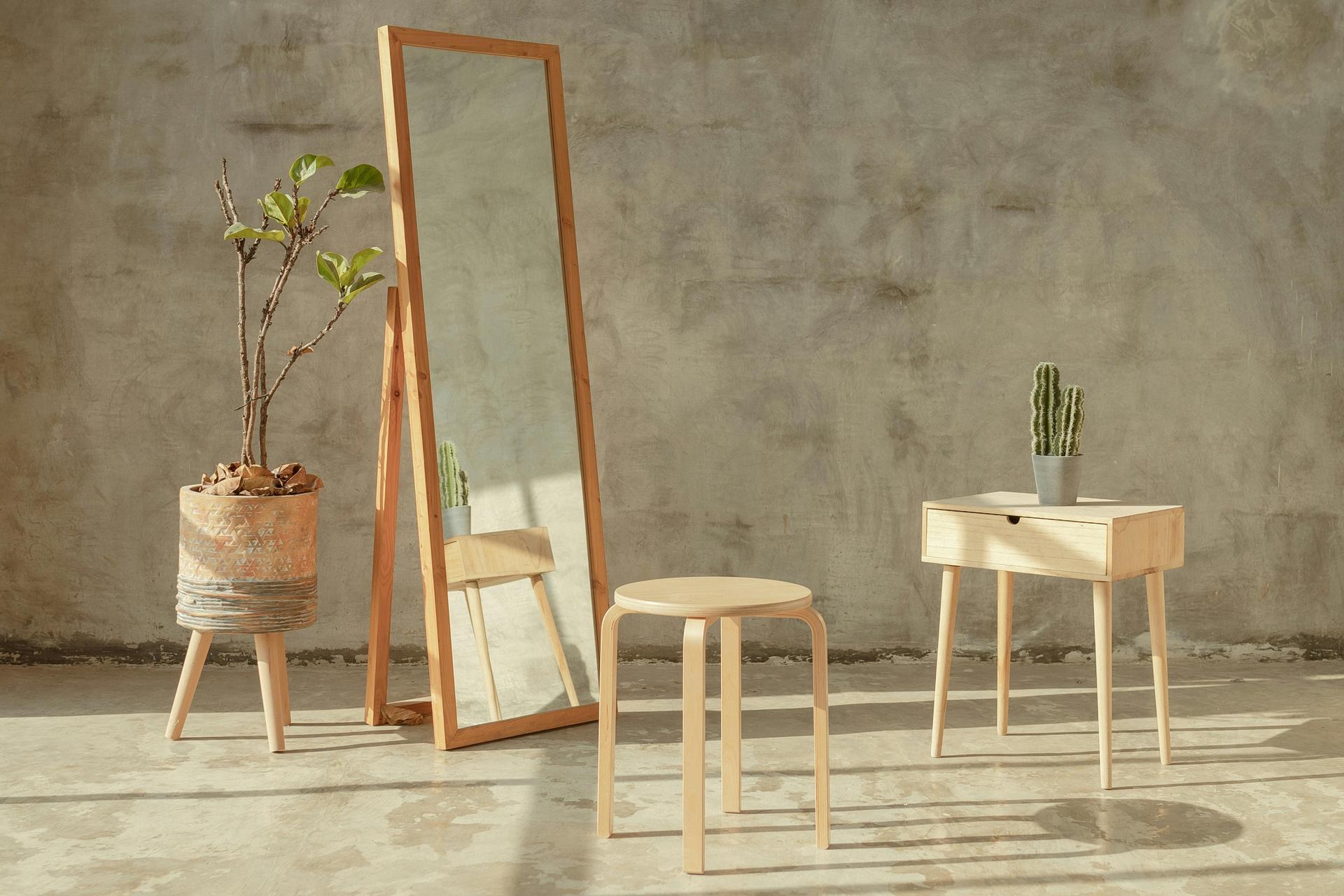
Northern European style rests on a handful of simple principles. The first is simplicity. Scandinavians avoid unnecessary ornament and favors clean lines and calm forms. The aim is not austerity for its own sake but a kind of quiet timelessness - objects that do not age overnight when fashions change. As Hans Wegner once said, good designs have no expiry date. That is why so many Nordic pieces look at home both in a flat from the 1970s and in a new apartment today.
The second pillar is functionality. Form follows use in a very direct way. Wegner's and Jacobsen's chairs were engineered around the needs of the human body. Alvar Aalto's Paimio chair was designed to help patients breathe more easily. Poul Henningsen's lamps were crafted to tackle glare and make light more comfortable for the eyes. Shaping things is there first and foremost to make life easier.
Third comes naturalness. Designers in the north have long reached for metal, wood, glass, cotton and linen and have made a point of revealing their texture rather than covering it up. Materials are meant to age well, not fall apart after a season or two. This sits naturally with a concern for durability and for the environment. The longer something is used, the less often it ends up in the bin.
The fourth pillar is humanism and a sense of cosiness. Scandinavian interiors are bright and open and full of soft textiles and wood, yet they avoid ostentation. Instead of the hard chill that minimalism can sometimes bring, there is "hygge" - a feeling of comfort and ease at home. Objects are simple, comfortable and cleverly thought through. They do not intimidate. They invite you to use them. That is one reason this aesthetic works equally well in a small studio flat and in a large family house.

The fabric of the city - contemporary Nordic architecture
Over time Scandinavian thinking moved beyond the scale of objects and even individual buildings. It began to shape whole slices of cities. Copenhagen has become one of the most interesting laboratories of contemporary urbanism, a place where the user is consistently placed at the centre. The city has made a conscious choice to prioritize pedestrians and cyclists over cars. Projects by Bjarke Ingels Group such as VM Houses and 8 House show how a residential building can function almost like a self contained neighborhood. Instead of a closed block there is a structure threaded with walkways, terraces, shortcuts and places to meet. CopenHill, a waste to energy plant topped with a ski slope and a climbing wall, is a kind of manifesto for the Scandinavian tendency to combine hard infrastructure with social use. The building does not pretend to be anything other than what it is, yet it still gives the city a new public space for recreation.
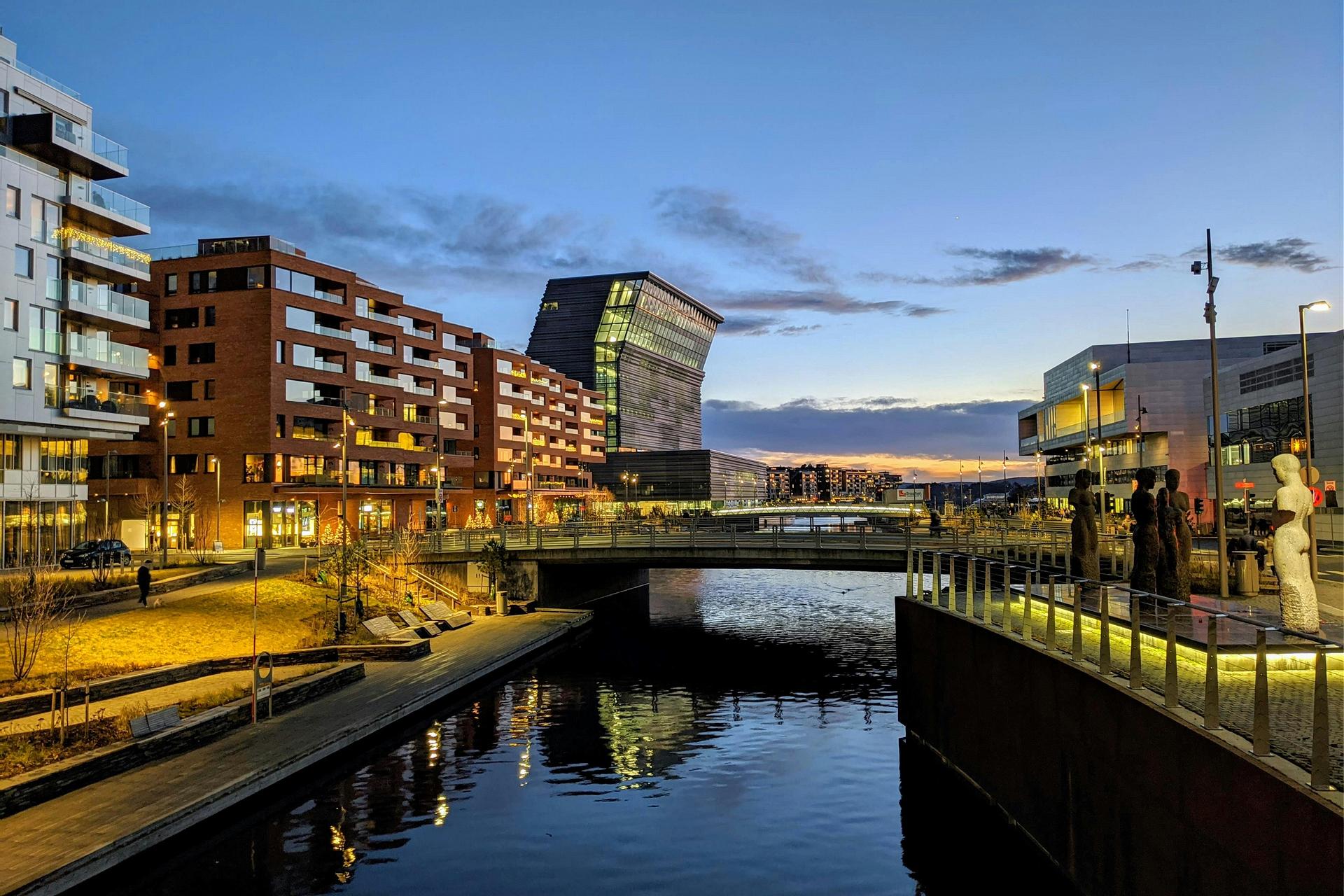
Oslo, in turn, has become a stage on which a very clear story about contemporary Norway is being played out. The National Opera House, projecting into the waters of the fjord, was designed so that its roof is open to residents and visitors. It is not only a home for opera and ballet. It is also a public terrace with views of the city and the water. It's worth adding that this building was designed by the Norwegian practice Snøhetta, whose first major success was winning the competition for the new Library of Alexandria in Egypt - a structure that looks like a huge, slightly tilted disc pressed into the Mediterranean shoreline. What defines Snøhetta's work is the way they treat architecture as an extension of the landscape. Their buildings often rise out of their surroundings like natural landforms, invite people onto roofs and terraces, and blur the line between what feels monumental and what is part of everyday life. Calgary Central Library, for example, looks from the outside like a block of carved ice, yet its interior is warm and inviting. Light pours in from above and bounces off pale wooden surfaces, turning the space into something between a library, a passageway and a communal living room for the city.
The raw Nordic landscape has taught architects a certain humility. Contemporary Scandinavian buildings do not try to dominate their surroundings - they complete them.
A short walk away the new Munch Museum acts as a contemporary city tower. Its leaning silhouette has quickly become one of the symbols of the capital. The Deichman Bjørvika library, with its glazed facades and spaces wrapped around a bright atrium, shows how a public institution can operate as the city's living room - a place to work, study and meet. The Barcode development, with its distinctive rhythm of tall, narrow buildings, marks the transformation of the old harbor into a modern business district. The waterfronts of Aker Brygge and Tjuvholmen, culminating in the Astrup Fearnley Museum, are examples of post industrial regeneration that weaves former docklands together with flats, offices, a marina and public promenades. At Fornebu, on the site of the old airport, the Equinor headquarters demonstrate how a large corporation can occupy a building that does not loom over its surroundings but hovers above a park on a set of stacked blocks. Completing this picture is the monumental Oslo City Hall, a reminder that today's modernity grows out of post war foundations rather than appearing from nowhere.
A similar logic is at work in Stockholm and Helsinki. Historic townhouses and classical civic buildings sit side by side with radical contemporary projects to create a mosaic in which each piece has its own voice, yet together they form a coherent whole. Modernist churches by Eero Saarinen and later work by studios such as Snøhetta reflect a typically Nordic concern with simple volumes, natural light and close contact with landscape. Timber construction and sustainable architecture now play an increasingly visible role. Some of the world's tallest timber towers can be found in Norway and Sweden. Wood is returning to the city not as a nostalgic reference to tradition but as a technologically advanced material of the future. The raw Nordic landscape has taught architects a certain humility. Contemporary Scandinavian buildings do not try to dominate their surroundings - they complete them. A wonderful example of this approach is Viewpoint Snøhetta (Tverrfjellhytta), perched high in the mountains on the edge of the Dovrefjell-Sunndalsfjella National Park. It is a small, rectangular pavilion with an organic wooden interior shaped as if it had been carved by wind and ice. One entire wall is a large pane of glass framing the Snøhetta massif and the landscape where wild reindeer roam. The brief for this building is very Scandinavian - to let people experience the mountains and observe animals in their natural habitat, while at the same time protecting the most sensitive areas from excessive tourist traffic.
Design that surrounds us
Today the Scandinavian way of shaping things operates at every scale of everyday life. It appears in the layout of neighborhoods and in the handle of a bread knife, in a TV remote and in the car parked on the street. It's often easiest to see where it is not shouting for attention - not in glossy books about design icons but in an ordinary flat where the lamp above the table does not dazzle, the chair remains comfortable after a long evening and the coffee pot feels secure in the hand.
Contemporary Nordic lighting from brands such as Louis Poulsen, Muuto and Normann Copenhagen draws a straight line back to Poul Henningsen's thinking on light as an instrument of comfort. You can see it in multi layered shades that soften light, in concealed sources, in the lack of harsh points and in subdued colors and materials that age gracefully. These lamps are there to create atmosphere rather than to act as jewelry for the interior. Smaller objects play a similar role. Kettles, jugs and vacuum flasks from Stelton, carafes and tableware from Eva Solo and kitchen tools from Rosendahl are all designed to be used every day without feeling like fragile museum pieces.
Looking at textiles and furniture the Nordic code becomes clearer still. Kvadrat fabrics are found in private homes, offices and hotels. They combine resilience with refined but calm color palettes. Marimekko, with its bold patterns, represents a more expressive side of Nordic aesthetics but still rests on clarity of form and good materials. Furniture from Hay, Muuto or String is built around simple volumes, modularity and a systems based approach to interiors.
In this context it is impossible to ignore Ikea, which for decades has acted as a global translator of Scandinavian ideas into the language of the mass market. The company founded by Ingvar Kamprad still follows the same basic vision. Well considered products should be affordable, functional and easy to transport and assemble. In Ikea catalogues you can find echoes of the Larssons, Aalto, Wegner and Jacobsen, filtered through the realities of large scale production. The company regularly collaborates with well known designers such as Ilse Crawford and Sabine Marcelis, sending their sensibilities into millions of homes worldwide. Thanks in part to this scale, Nordic aesthetics have become one of the most instantly recognizable visual codes on the planet.
The same code is visible in electronics, in cars and in products that sit somewhere between engineering and lifestyle. For decades Volvo has treated cars as mobile extensions of the home. Step inside and you often feel as if a Scandinavian living room has been carefully compressed around the driver and passengers. Light colors, restrained lines, intuitive controls, natural materials wherever your hands tend to rest - everything is arranged to support a sense of calm and safety. Saab for many years offered a more technical, almost aeronautical character, yet again rooted in ergonomics. The cockpit was meant to wrap around the driver, not overwhelm them with special effects. It is another version of the same idea that stands behind a well designed chair or desk. In aviation you can see a similar sensibility in the cabins of SAS airliners. Muted colors, calm horizontal lines, carefully planned lighting and textiles with a quiet yet distinct texture all help ensure that passengers feel less as if they are locked inside a metal tube, despite the limited space.
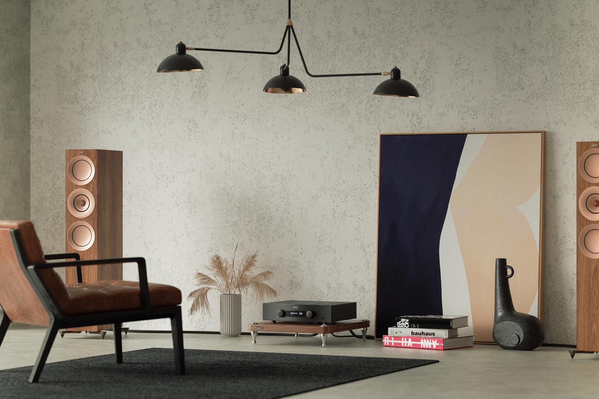
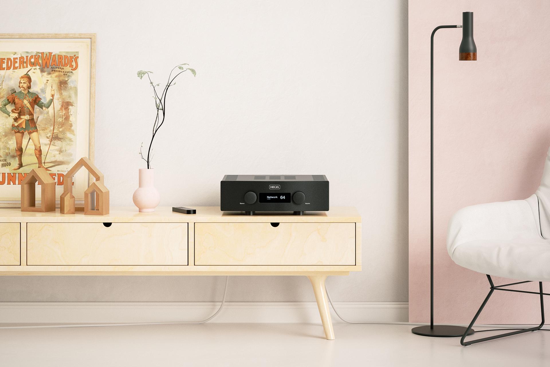
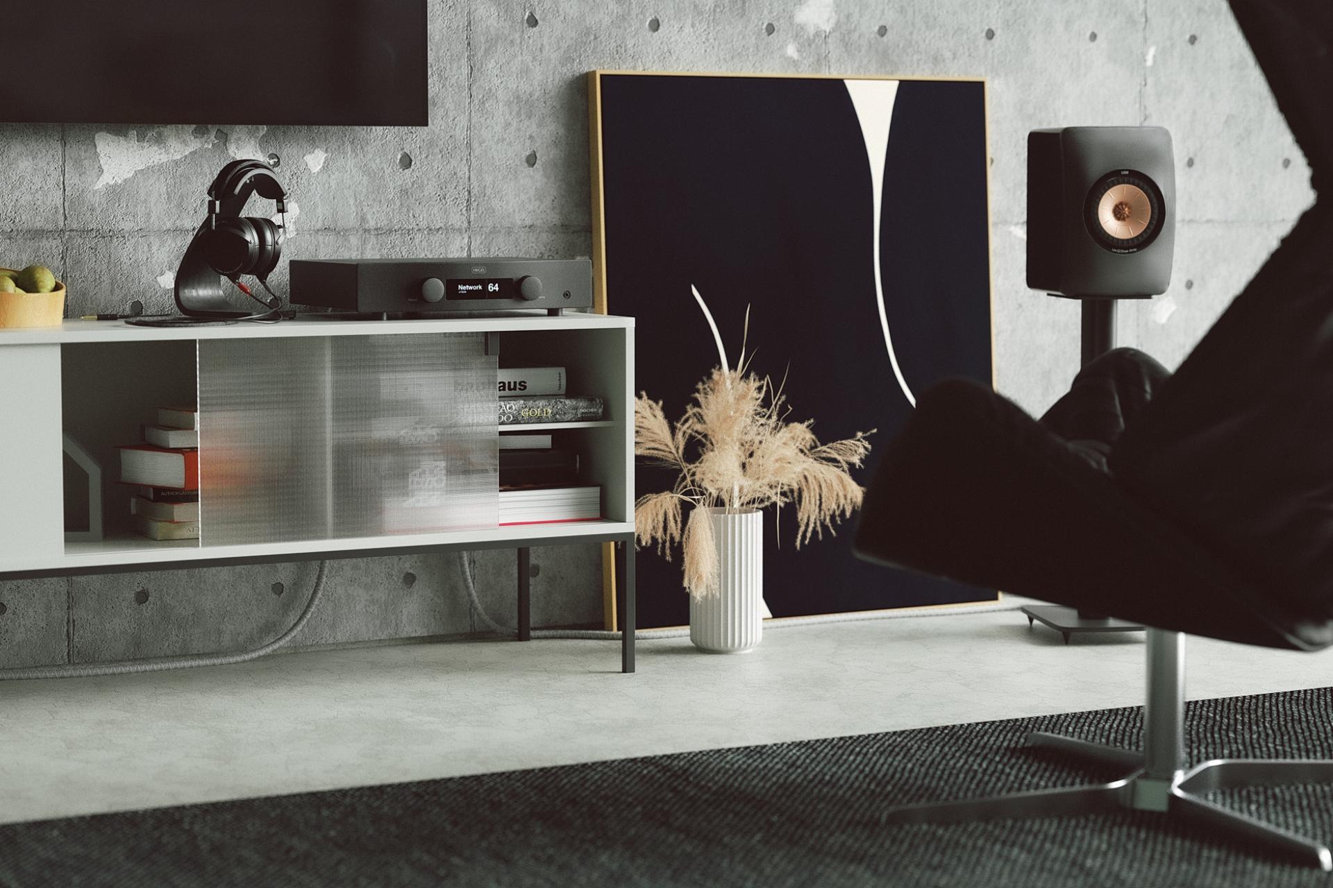
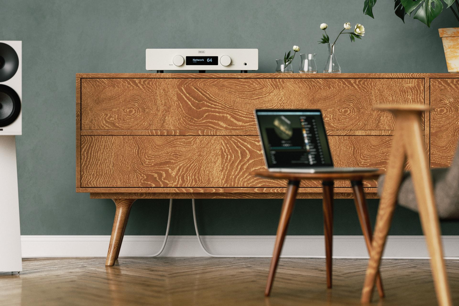
Taken together, the efforts of designers and companies, from tiny lighting studios to international retail chains, have made Scandinavian style feel almost like air. It is around us even when we do not consciously register it. In the lamp over the desk, in the handle of a knife, in the chair at the table, in the car we take to work and, increasingly, in audio equipment. Simple forms, natural materials, neutral colors, light, order and respect for the user form a code that emerged from the demanding climate of the north and is now understood almost everywhere. That is why it so easily finds its way into hi-fi, where products are expected not only to sound good but also to sit comfortably in the spaces where we live.
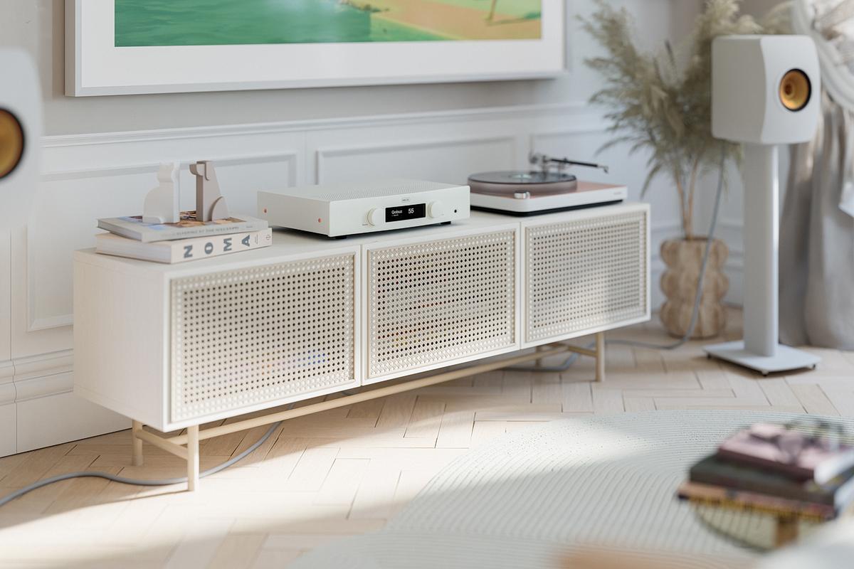
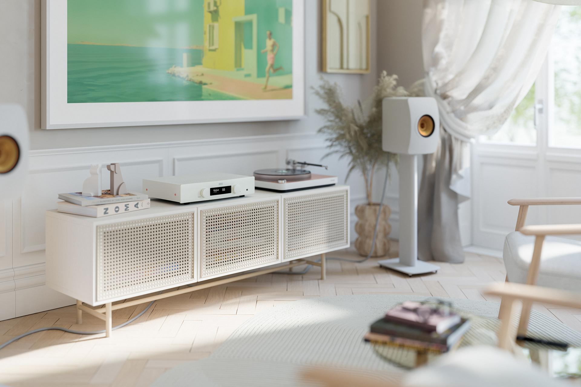
Scandinavian design in Hegel Music Systems
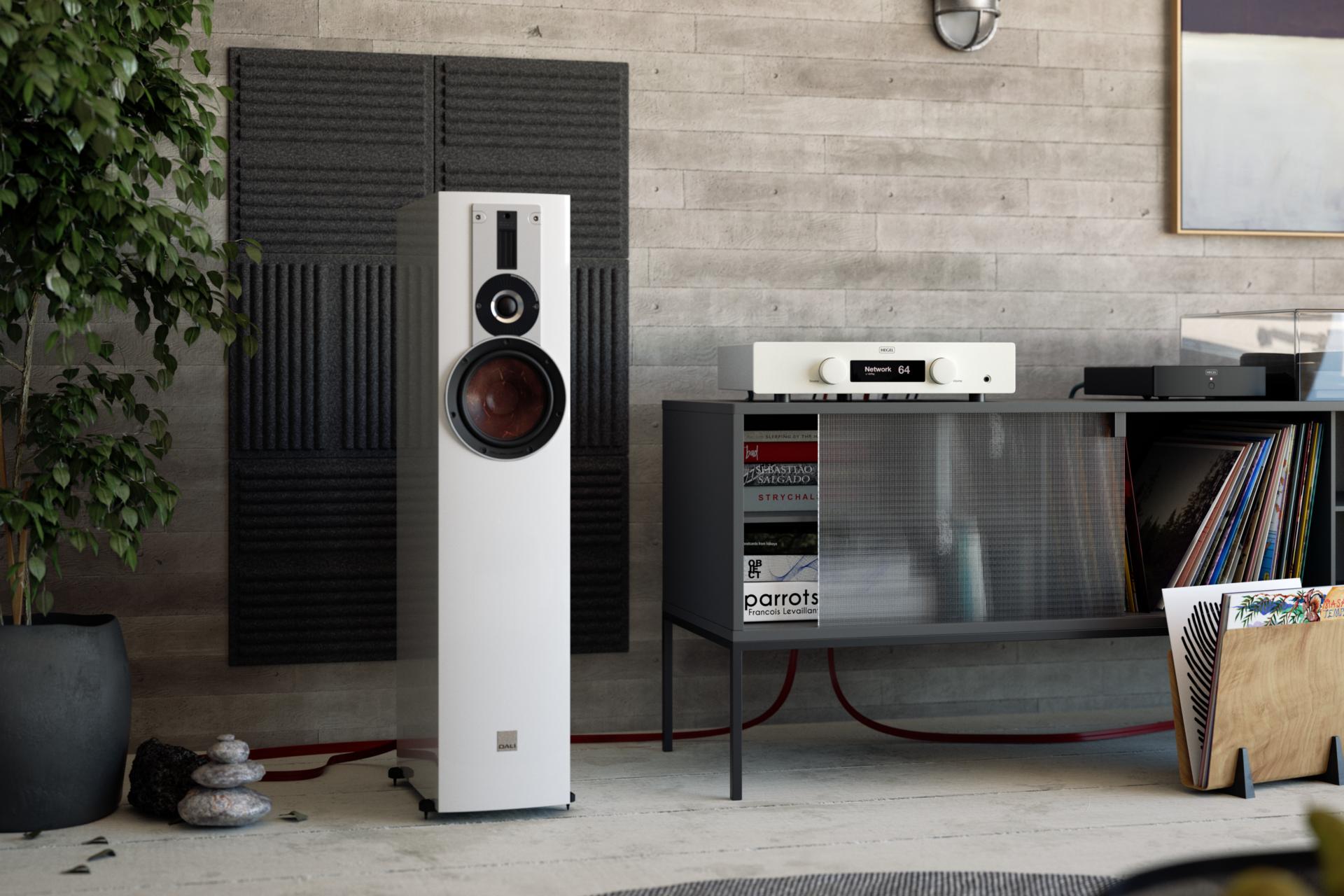
Hegel is one of those brands that invite the label "Scandinavian" at a glance, but the story does not begin or end with how the products look. Black or white rectangles, two large knobs, a discreet logo, no shiny ornaments - our amplifiers have looked like this for most of the company's life. Against a backdrop of competitors who try to catch the eye with gold plated controls, glowing meters and galaxies of blue LEDs, Hegel units can seem almost too modest. Yet if you look a little more closely it quickly becomes clear that this is not simply a matter of styling. The way our products are built, the way they behave and even the way we think about price sit squarely within the Nordic philosophy we have been describing. Hegel does not only make gear that looks Scandinavian. It operates very much like a Nordic design studio that understands its job differently from most consumer electronics brands.
To start with, Hegel did not spring from a polished business plan or a tidy slide deck. It grew naturally out of a simple practical need. The company's founder, Bent Holter, was a young engineer and musician. He studied at NTNU in Trondheim and played in a rock band in his spare time. He needed a sound system that would do the band justice, and trying to build one himself, he ran into the same problems everyone else faced at the time. Conventional amplifiers had clear limitations, and distortion remained one of the biggest enemies of good sound. Bent treated that as an engineering challenge and set about finding a way to push distortion down dramatically. Out of this obsession came the technology that would become the company's foundation - SoundEngine, a circuit that eliminates distortion in real time. The goal was simple and demanding at once - to pass the signal through as faithfully as possible, without adding anything of its own.
Learn more about our company's history here.
Once Bent had built amplifiers for his own band, it did not take long for others to ask whether he could build units for them as well. That is where the story began - a story of a company whose amplifiers, digital to analogue converters, phono stages and multichannel power amps now find their way to music lovers around the world. It's a story with a very Scandinavian origin. There was no huge investment followed by an attempt to sell products that no one really needs. Instead, what we saw here was a gradual evolution driven by the desire to solve a specific technical problem.
Over time that engineering idea turned into a broader philosophy. At one point we used the motto "Nothing added, nothing taken out - no artificial ingredients". Equally important, though less formal, was another line that kept surfacing in conversations around the company - that our products should be "caviar at the price of sausages". The phrase may be playful, but the point behind it is serious. From the outset we wanted to offer sound quality that could stand comparison with far more expensive rivals, but without the trimmings that customers usually end up paying for.
To make that ambition real, a series of very concrete decisions had to be taken. Do not spend money on decorations. Do not add rows of sockets that no one will ever use. Do not pile on features just because they look impressive in a brochure. Channel resources into the areas that actually influence sound, robustness, practicality and long term reliability. At that point you are no longer dealing with a marketing slogan, but a consistent way of working and developing future products.
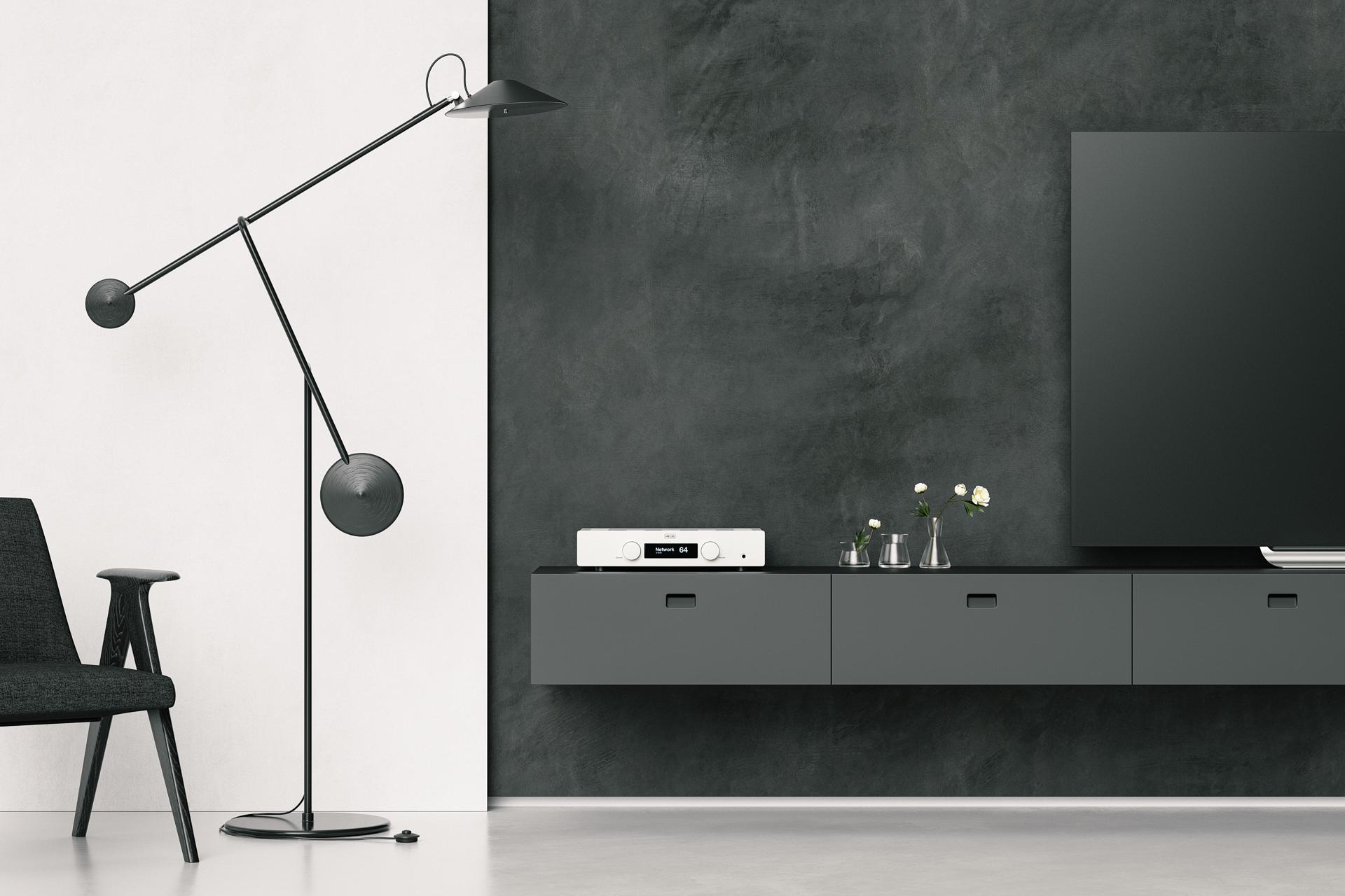
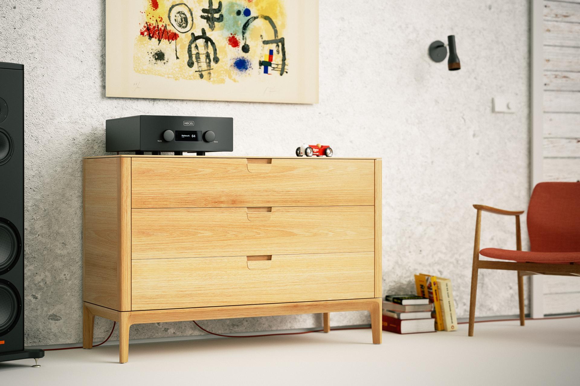
The front panel is the most visible expression of that thinking. Today's Hegel amplifiers look as if they have been sketched in a single, continuous line. A thick machined aluminum plate forms a solid, almost architectural facade. Two large knobs anchor the sides. Between them a small, clear display does only what it needs to do - show the active input and volume level. On some models there is a discreet headphone socket. Buttons are tucked under the lower edge of the front so that they do not break the smooth surface. Most of our devices are available in only one color - black - which helps to reduce costs for the customer. Some models are available in white. And that's it. No piano gloss finishes, no fashionable seasonal tones, no limited editions in gleaming copper (although we do have such experiments in our tiny museum). Changes in the external appearance are evolutionary rather than revolutionary. It's the same logic you find in classic Scandinavian lamps or cheese slicers. When a form works, there is no reason to reinvent it every year.
The same consistency extends across the whole range. Whether you are looking at an integrated amplifier, a power amp, a preamp or a converter, you can tell immediately that these products belong to one family. Front panels share proportions. The layout of elements feels familiar. The interface behaves in a predictable way. Even when a particular model has more buttons or a deeper menu, the underlying language of form stays the same. The product line is structured. Model names are built around numbers, not elaborate labels. New units do not appear every season. They replace their predecessors calmly, after many years on the market, and the replacement is introduced not because of a new feature or input, but because it is a solid upgrade in sound performance. The approach is closer to a well run Scandinavian furniture maker than to a typical consumer electronics company living from one launch cycle to the next.
See all products in our current catalog here.
Nordic thinking, however, is always as much about what things do as about how they look. In Hegel's case this is clearest in how we design the user experience. An amplifier today is expected to act as the heart of a system and to simplify daily use, not turn it into a never ending dance through menus. Many of our units offer features such as automatic detection of an active input or controlling volume with a TV remote. Inputs are clearly labelled. Switching between sources is quick. Menus are free of exotic options that are tempting on paper but rarely needed in real life. The aim is not to make the customer feel that they have bought a computer. The device should do its job and then quietly step aside, letting everyday listening rituals take over. That is very much the Nordic way of thinking about technology. It should be present and reliable, but it does not need to constantly announce itself or retell the story of the latest firmware update each time you press a button.
The philosophy becomes even more interesting when you look at technical choices. Hegel was one of the early companies to step decisively into outboard converters and then into streaming. At first our digital stages were separate components, but at a certain point they moved inside integrated amplifiers. When many manufacturers were only starting to experiment with digital inputs or offering amplifiers with a single USB socket, Hegel's popular models already provided a full set of digital connections and solutions such as the DAC Loop. Today the company is still at the front of the technological pack in audio. Apple AirPlay, Google Cast, Roon, Spotify Connect, Tidal Connect, Qobuz Connect, Hegel Control app - we work continuously so that our customers can use these platforms as early as possible.
Even so, we do not treat every new buzzword as an automatic requirement. For a long time, for example, we resisted adding Wi Fi. From the outside that might look like a reluctance to adopt new ideas. In reality it is a very Scandinavian form of pragmatism. Wi-Fi adds noise but a cabled connection does not, and if a solution does not meet our standards, it does not go inside just because it happens to be fashionable. Our equipment is meant to behave more like a good piece of furniture - something you buy once and live with for many years.
This way of thinking is closely linked to matters of price and value. The "caviar at the price of sausages" line is more than a casual joke. At Hegel we try hard to avoid spending money in ways that do not translate into real benefit for the user. Instead of investing in elaborate connectors that will never be used, we pour resources into the parts you do not see straight away - high quality power supplies, carefully tuned output stages, solid mechanics, robust chassis and components chosen for long term stability. This is equipment you switch on day after day for years and still looks and behaves as it should.
Against that backdrop, Hegel's sound can also be viewed as part of its aesthetic. It is not only that our products collect awards for how they play. We are grateful and proud of those, but what matters even more is the feedback from people who live with our gear. It tells us that we think about music and sound in broadly the same way as thousands of listeners around the world. For years our engineers have aimed at neutrality understood not as coolness or sterility but as the absence of a strong, fixed signature. In practice this means that our amplifiers and digital stages do not push a system in a single direction. Our goal is to stay as true to the music as possible.
Instead, they tend to reveal the character of whatever they are partnered with. You can combine them with speakers that sound bright, dark, big and powerful or tight and controlled, and Hegel components will allow those traits to come through rather than smoothing them away. That, too, is a form of functionality. The user has the freedom to shape the sound of the system by choosing loudspeakers and sources instead of being locked into one predetermined sonic aesthetic. In the world of Scandinavian style people often talk about democracy and openness. For us that idea manifests itself precisely in this - in equipment that does not restrict the user but gives them room to explore different paths.
Put all of this together - the company's roots in a concrete technical problem and the needs of a working musician, the engineering focus on distortion, the refusal to waste resources on things that do not matter, the minimalist yet carefully drawn enclosures, the coherent product range, the thought through user experience, the sonic neutrality, the competitive pricing achieved through intelligent design and production, and the built in longevity that follows naturally from minimalism and ecological responsibility - and you end up with a clear example of Scandinavian thinking translated into the world of hi-fi.
Our ambition has never been to build equipment that shouts for attention from anyone who enters the listening room or that stamps every record with such a distinctive sound that you can identify it in a few seconds. Quite the opposite. Our devices are meant to behave like a comfortable chair or a well proportioned lamp. They are there to stand quietly in the living room, not to push themselves forward, not to tire the owner and not to look outdated after two seasons. They are there to please the person who uses them, to do their job and to let them focus on what really matters - the music.